


Logo
NAPAS’s logo originates from the idea of “connection and
convergence”. The logo is a combination of brand name and symbol,
representing the notion that many cards meet at the center point to
convey the message "One connection. All payments". The two cards
making up an arrow is embedded in the symbol, signifying the future
of Vietnamese payment market through the use of young leaf color.
Download logos
Slogan
The slogan “One connection. All payments” carries the message of the
values that NAPAS brings to our customers. With one single
connection, NAPAS provides our customers with multiple means of
payment including cards, bank accounts, QR codes, Mobile Money, etc.
in order to meet the demands of every retailing and payment
activities of Vietnam. Furthermore, our slogan is also an
illustration of Vietnam digital economy’s development, in which
NAPAS connection provides modern and inclusive methods of payment in
the future.

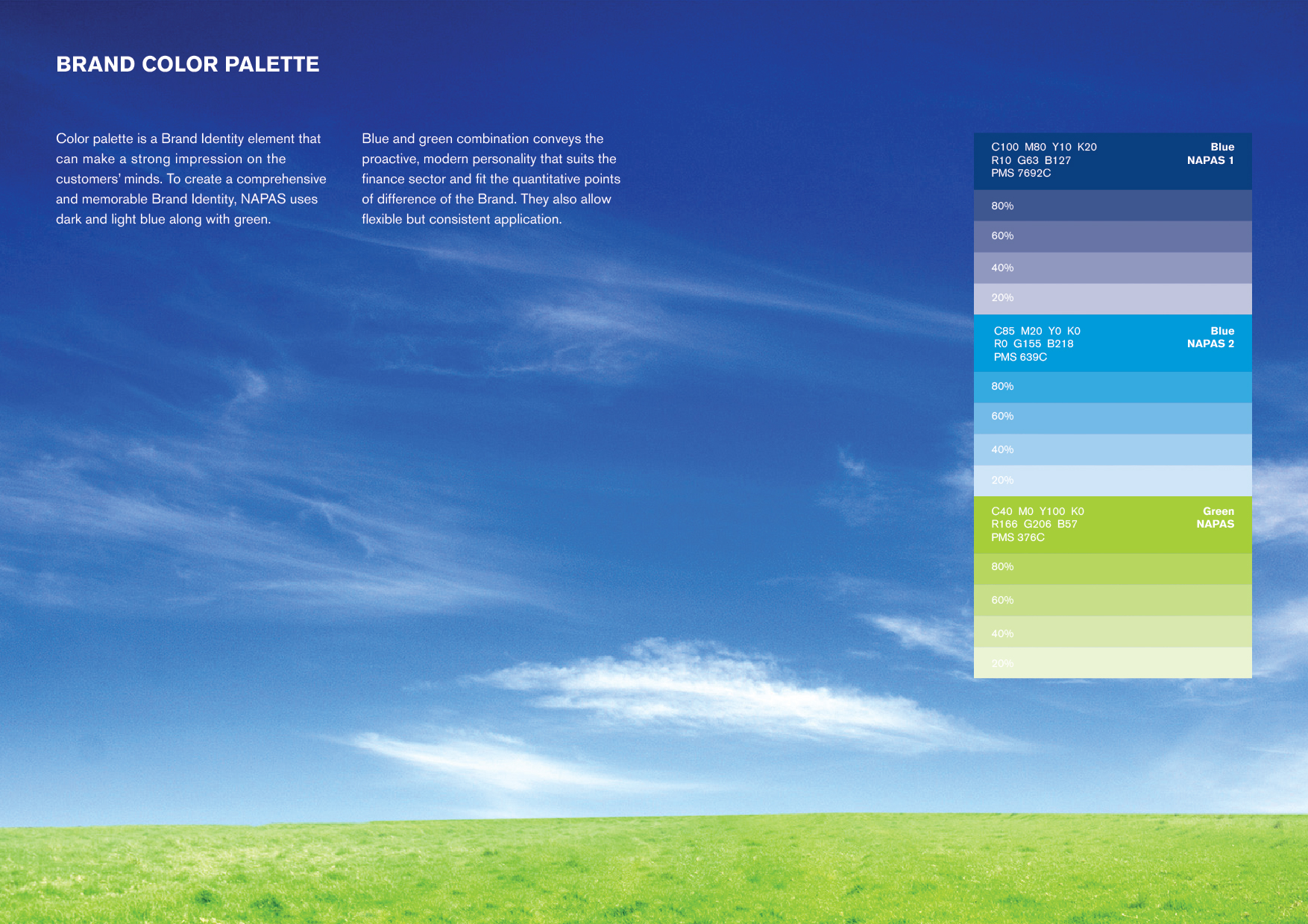
Brand color palette
Color palette is Brand Identity element that can make a strong
impression on the customers' mind. In order to create a
comprehensive and memorable Brand Identity, NAPAS uses dark and
light blue along with green. Selected thoroughly based on the spirit
of the brand, the tones of blue and green are combined harmoniously,
conveying the proactive, modern personality that suits the finance
sector and fit the quantitative points of difference of the Brand.
In order to use these colors flexibly and to maintain consistency at
the same time, a strip of colors ranging from dark to light blue and
green was standardized, helping NAPAS to easily manage the
application of colors in different communication documents.